Professional brand guidelines for the Exit Insights podcast and consultancy, presented by Exit Factor.
Brand Overview
Exit Insights is dedicated to helping business owners prepare for exit so they can maximise value and exit like a boss[1]. The podcast targets UK SMEs with £1-30 million revenue, addressing the 55% of exits that are unplanned and the 80% of deals that never complete[1].
Mission
Help business owners structure their businesses so they’re among the 20% who complete successful exits, using a defined methodology.
Logo System
The Exit Insights logo uses Futura in bold uppercase, projecting confidence and strategic clarity. The geometric sans-serif letterforms reinforce the systematic, methodical approach to exit planning.
Logo Variants
Full Colour Logo (Primary)
Use this version on light backgrounds and in digital applications where colour is supported.
Monotone Logo (Dark)
Use on light backgrounds when colour printing isn’t available or for specific design applications.
Square Format Logo
Use for social media profiles, favicons, app icons, and any context requiring a 1:1 aspect ratio.
Logo Clear Space
Maintain clear space around the logo equal to the height of the “EXIT” letterforms. Never crowd the logo with text, graphics, or edge boundaries.
Minimum Sizes
- Print: Minimum 25mm wide for horizontal logos, 15mm for square format
- Digital: Minimum 120px wide for horizontal logos, 60px for square format
Logo Don’ts
- Don’t stretch or distort the logo
- Don’t change the colour proportions
- Don’t add effects (drop shadows, gradients) unless specifically approved
- Don’t place on busy backgrounds that compromise legibility
Colour Palette
The Exit Insights colour palette balances professional authority with approachable guidance, reflecting the premium yet accessible nature of exit advisory services.
Primary Colours
Deep Navy Blue
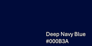
- Hex: #000B3A
- Usage: Primary anchor colour for headers, key UI elements, and premium positioning
- Psychology: Professional, confident, authoritative[5]
Slate Blue

- Hex: #4A6FA5
- Usage: Secondary brand colour, sophisticated trustworthiness without corporate sterility[5]
- Psychology: Sophisticated, trustworthy, modern
Secondary Colours
Muted Teal
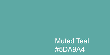
- Hex: #5DA9A4
- Usage: Secondary anchor for innovation and growth messaging[5]
- Psychology: Strategic advancement, innovation, growth
Gold Accent

- Hex: #F7B801
- Usage: Premium positioning, call-to-action elements, highlights
- Psychology: Premium, valuable, strategic[5]
Supporting Colours
Soft Mint

- Hex: #B2F2BB
- Usage: Success states, positive feedback, wellness-oriented messaging that humanises B2B interactions[5]
Light Grey

- Hex: #F1F3F4
- Usage: Backgrounds, subtle dividers, maintaining clean professionalism[5]
Dark Charcoal
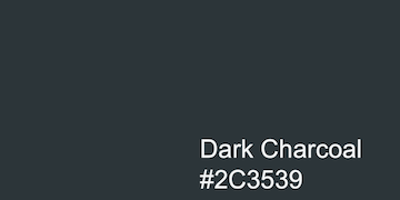
- Hex: #2C3539
- Usage: Primary text colour instead of pure black, reducing eye strain during extended reading on content-heavy pages[5]
Typography
Logo Font
Futura (Bold, Extra Bold, or equivalent)
- Use exclusively for the Exit Insights wordmark
- All caps with generous letter-spacing
- Never substitute with geometric sans-serifs like Avenir or Gotham for the logo
Body Font
Arial (Regular, Bold, Italic)
- Use for all body text, headers, and UI elements
- Readily available system font ensures consistent rendering across all devices
- Maintains professional clarity without licensing complications
Type Hierarchy
H1 – Page Titles
- Font: Arial Bold
- Size: 32-36px desktop, 28-32px mobile
- Colour: #000B3A (Deep Navy Blue)
- Line height: 1.2
H2 – Section Headers
- Font: Arial Bold
- Size: 24-28px desktop, 22-26px mobile
- Colour: #4A6FA5 (Slate Blue)
- Line height: 1.3
H3 – Subsection Headers
- Font: Arial Bold
- Size: 20-24px desktop, 18-22px mobile
- Colour: #2C3539 (Dark Charcoal)
- Line height: 1.4
Body Text
- Font: Arial Regular
- Size: 16-18px desktop, 15-17px mobile
- Colour: #2C3539 (Dark Charcoal)
- Line height: 1.6
- Paragraph spacing: 1.5em
Captions / Small Print
- Font: Arial Regular
- Size: 14px
- Colour: #2C3539 with 80% opacity
Voice and Tone
Exit Insights communicates with straightforward authority – no corporate jargon, no fluff, just honest guidance from practitioners who’ve advised hundreds of businesses.
Key Principles
Direct and Honest
- Speak plainly about complex topics (EBITDA, earn-outs, valuation multiples)
- Acknowledge the emotional reality: “You’re running out of energy” or “feeling stressed”[1]
- Avoid euphemisms – call things what they are
Expert but Approachable
- Demonstrate deep business exit and M&A expertise without condescension
- Use real examples from the methodology
- Reference actual guest experiences from the podcast[6]
Action-Oriented
- Every piece of content should move owners toward exit readiness
- Focus on systems, processes, and tangible improvements
- Emphasise preparation timeline (2-3 years minimum)[1]
Sample Phrasing
Instead of: “We facilitate strategic exit planning initiatives”
Use: “We’ll help you prepare your business for exit”
Instead of: “Optimise enterprise value through systematic preparation”
Use: “Increase what your business is worth by getting it exit ready”
Instead of: “Leverage our proprietary framework”
Use: “Use the steps that have helped hundreds of owners exit successfully”
Visual Language
Photography Style
- Subjects: Real business owners (not stock models), professional advisors in natural settings
- Treatment: Natural lighting, authentic moments, minimal retouching
- Mood: Confident but approachable, experienced but not intimidating
Iconography
- Style: Simple line icons with 2px stroke weight
- Colour: #4A6FA5 (Slate Blue) primary, #5DA9A4 (Muted Teal) secondary
- Size: 24px standard, 32px for featured icons
Data Visualisation
- Charts: Use brand colours with maximum 3 colours per chart
- Primary: #4A6FA5 (Slate Blue)
- Secondary: #5DA9A4 (Muted Teal)
- Accent: #F7B801 (Gold) for highlights
- Backgrounds: #F1F3F4 (Light Grey)
Application Examples
Website Headers
Use Deep Navy Blue (#000B3A) for main navigation and page titles, with Slate Blue (#4A6FA5) for secondary navigation elements.
Podcast Episode Graphics
Feature guest photos with the square format logo in the bottom-right corner, using Light Grey (#F1F3F4) backgrounds and Dark Charcoal (#2C3539) text.
Call-to-Action Buttons
Primary CTAs use Gold (#F7B801) with Dark Charcoal (#2C3539) text. Secondary CTAs use Slate Blue (#4A6FA5) with white text.
Success Messages
Use Soft Mint (#B2F2BB) backgrounds with Dark Charcoal (#2C3539) text for positive feedback, form confirmations, and success states.
Implementation Notes for WordPress
CSS Custom Properties
:root {
  --exit-navy: #000B3A;
  --exit-slate: #4A6FA5;
  --exit-teal: #5DA9A4;
  --exit-gold: #F7B801;
  --exit-mint: #B2F2BB;
  --exit-grey: #F1F3F4;
  --exit-charcoal: #2C3539;
}
Theme Integration
When using the Twenty Twenty-Five theme:
- Upload the square format logo as your Site Icon (Settings → General)
- Use the full colour logo in your header template
- Apply colour customisations via Appearance → Customize → Colors
- Set Arial as your primary font in the typography settings
File Formats
- Web: Use JPEG for photos, PNG for logos with transparency
- Print: Provide PDF versions with embedded fonts
- Social: PNG at recommended sizes (1200×630 for LinkedIn, 1080×1080 for Instagram)
This style guide ensures consistent, professional representation of Exit Insights across all touch points, reinforcing the brand’s position as the authoritative voice in SME exit planning.